Do’s and Don’ts of Using Color in Your Brand

You have uncovered your Power Profile and chosen your brand colors… Now what? How do you successfully use these colors in your brand with authenticity, visual interest, and meaning?
This blog guides you through the most important do’s and don’ts when it comes to actually using your brand colors throughout your business, and where you show up as the face of your brand.
Choose Your Neutrals
Your Power Profile will need a backdrop on which to shine. While your neutrals don’t have as much influence on your brand personality as your Power Profile, they do have some – so you’ll want to make an educated choice. If you received a neutral color like white, black, or gray as a secondary Power Profile result, that may be a good choice to base your neutral palette off of.
You could also choose a cream-y, muted, neutral shade of one of your secondary Power Profile colors. But, pay attention to which colors you’re using, because even muted shades will communicate some of the qualities of those Power Profiles – so you’ll want to make sure they’re aligned with you and your brand.
Overall, do choose neutrals that are relevant to the rest of your brand, and don’t use any color without knowing what it communicates to your audience.
Determine Tints, Shades and Tones
Before going into how to choose your shades, tints, tones, and hues, let’s quickly define the difference:
- “Tints” refer to the color + white, essentially lightening the color.
- “Shades” refer to the color + black, essentially darkening the color.
- “Tones” refer to the color + gray, essentially muting the saturation of the color.
The different variations of each color will portray their own energies and meanings – so it’s important to consider this information when determining your brand’s color palette. Dark shades tend to convey a more professional, mature or serious look, light tints tend to convey a more calm, spacious or relaxing look, and bright tones tend to convey a more playful, fun look.
For example, let’s say your main Power Profile result was Green… How do you know what your green should look like? The first thing you need to consider is how you want your brand to come across. If you want to portray a mature, established, reliable brand, consider using forest green. If you want to portray more of a relaxed, calming vibe, try a softer sage green. Or if you want to portray a fun, upbeat brand, use a brighter color like spring green.
Overall, do pay attention to the different variations of color you’re using and the message they send, and don’t choose a shade, tone or tint without first considering how it will be interpreted by your audience.
Fine-Tune Your Brand Voice
Aligning the personality of your brand voice with your Power Profile and color palette allows you to create a more consistent brand experience.
By using the wording and personality associated with your Power Profile, you’ll create a cohesive, memorable brand that elicited a consistent experience across your business.
Each Power Profile result comes with a bank of words that are relevant to the meaning and energy behind the color, and the Impact Tribe’s Consistent Content Creation System features word banks to use for on-brand marketing and social media content.
Overall, do align your brand voice with the personality behind your brand colors, and don’t create a discombobulated, disconnected brand with conflicting visual and verbal messaging.
Align Your Wardrobe
How do you decide what to wear when you’ve been invited to give a presentation, speak at a conference, or meet with a potential new client?
One key thing to consider is your brand’s color palette. By wearing your brand colors – similar to speaking in your Power Profile’s brand voice – you create a cohesive experience by visually correlating what you’re wearing to what you’re saying and how you’re positioning your brand through your website and marketing materials.
Overall, do wear colors that communicate your brand personality and align with the rest of your brand, but don’t dress from head to toe in a single color – this can end up looking tacky. A little bit of your brand color goes a long way! Utilize your neutrals when it comes to your wardrobe because they can make a great backdrop for the rest of your colors to pop!
Incorporate Your Colors into Your Brand Imagery
I’m sure you’ve heard the saying, “a picture is worth a thousand words,” and that’s even more true when it comes to branding. Your brand imagery is very important – it needs to communicate your brand values, allow your audience to get to know you and your interests, help you sell your offers, AND portray your brand personality.
One of the ways you can portray your brand personality through imagery is by sprinkling your main colors throughout the imagery, or choosing/taking images that feature your color. This applies for anywhere you share imagery – including your website, social media, and more.
Overall, do consider the colors (in outfits, backgrounds, etc.) that will be featured in your brand imagery, and don’t use imagery that completely conflicts with your brand colors and personality.
Design Your Website
When designing your website, one of the first things to consider is the color scheme, and which of your brand colors will be used for which elements. I recommend heavily relying on your neutral palette on your website so as not to overwhelm your viewers, and use stronger, brighter colors as accents, highlights and the occasional section background.
Of course, don’t plaster your entire website in one color. Add variation, consider different sections and visual blocks separated by colors, use color to make the most important parts stand out, and make it easy for the eyes to follow.
When it comes to text, I strongly recommend using accent colors only for headlines, buttons, or calls to action – never for body text, which should be as legible and black-and-white as possible.
If you have a more cool-toned, relaxed color profile, like blue or green, you may want to reconsider choosing a supporting color that’s more action oriented for buttons – like red, yellow, gold or orange.
Overall, do use variety and accent colors to draw attention where you want it to go, and don’t be so rigid in your design choices that your website ends up lacking meaning and intrigue.
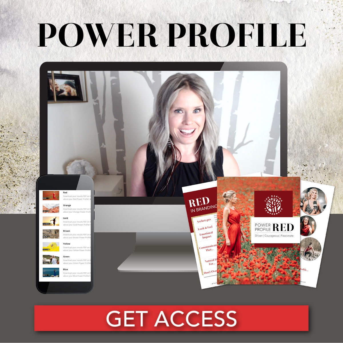
Have you discovered your brand colors yet? If not… What are you waiting for?! Get started with the Power Profile today to uncover your brand colors, personality, voice, and overall energy so you can create a brand that not only appeals to your ideal clients, but one that also resonates authentically with you as the leader of your brand.
Discover Your Brand Personality...
Use the power of timeless archetypes to unleash your brand's core strengths.